"I couldn't be happier with the website design by LoudLocal." ~ Tara, Owner of Head, Hair & Beauty
SERVICES:
Website Design


The Brief
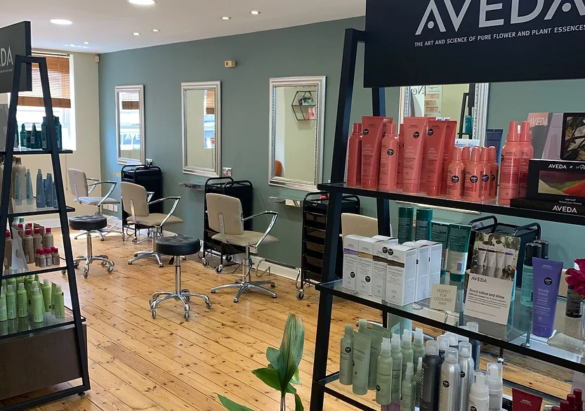
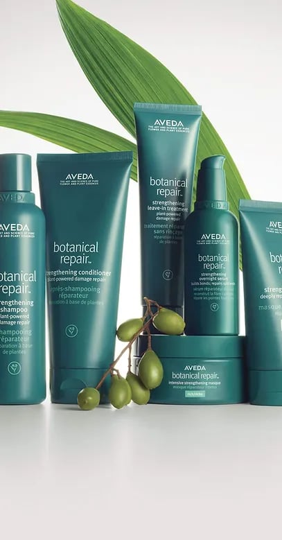
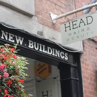
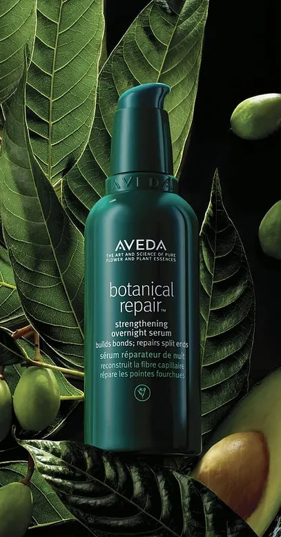
Head, Hair & Beauty is an Aveda hair salon based in Exeter. They came to us looking for help in giving their website a refresh, wanting a consistent design throughout the site that would successfully represent their brand and Aveda partnership. They also wanted the website to be more user friendly and wanted to increase the number of bookings through their website.
Instead of going for a full website revamp, Head, Hair & Beauty decided to go for 6 hours of time to be spent on the website with their top priorities being the home page, contact us page and price list. We also supported Head, Hair & Beauty with an alternative payment plan, so they were able to spread the cost of the work in two manageable payments.
Objectives
- Creating a contact page
- Refresh price list
- Redesign home page
PHASE 1
Contact Us Page.
The first task was to redesign the header and footer across the site so it displayed all the information needed clearly to potential clients.
We kept the brand colours inline with how they were previously but brightened the overall look of the site by complimenting the green with a cream and white colour scheme instead of the previously used dark grey.
We then set about creating the 'Contact Us' page, this is an important page that needed adding to the site not only because it will help potential clients find important information and be allow them to contact the salon easily but it is also effective in helping boost SEO.
%20with%20how%20well%20it%E2%80%99s%20built%20for%20optimal%20performance.%20This%20gr%20(11).png)
PHASE 2
Home Page.
The next page we focused on was the home page, before we started work the home page was very slow loading due to how the linked Instagram account displaying every post on the page. To fix this we limited the number shown to six of their most recent posts which will be automatically update.
The next step improving the home page was making it a full width page, using a full width image banner at the top of the page. Using the responsiveness tools on Wix allowed us to create this dramatic look whilst allowing it to scale to fit every screen size from desktop to mobile.
We also reduced the number of different call to actions, this makes it a lot clearer for users to navigate the site and know exactly where each button will take them.
A small section within the home page telling people about the salon was also added, this will help with SEO as the home page previously lacked any relevant copy and will also help users find out a bit more about the salon quickly and easily.
%20with%20how%20well%20it%E2%80%99s%20built%20for%20optimal%20performance.%20This%20gr%20(10).png?width=755&height=424&name=Info%20youll%20need%20to%20reword%20for%20explaining%20the%20grade%20how%20fast%20your%20page%20performs%20(in%20terms%20of%20loading%2c%20interactivity%2c%20and%20visual%20stability)%20with%20how%20well%20it%E2%80%99s%20built%20for%20optimal%20performance.%20This%20gr%20(10).png)
PHASE 3
Price List.
The price list before was was very hard to read and the colours lacked contrast reducing it's accessibility. To improve the page we focused on creating clearly defined sections, making it easier for to clients to find exactly what they're looking for. Using the orange accent colour helped to add some warmth to the page as well as helping to divide the sections.
%20with%20how%20well%20it%E2%80%99s%20built%20for%20optimal%20performance.%20This%20gr%20(13).png)
PHASE 4
Meet the Team Page.
The previous about us page was inconsistent, difficult to read and lacked colour, meaning it didn't represent the brand's identity. To improve this page we used a box system to separate each of the team, keeping the design clean an clear. On this page we opted to focus on mainly using the cream colour used throughout the rest of the site accented with the orange. This fitted with the rest of the site whilst not taking away from the text or images on the page.
%20with%20how%20well%20it%E2%80%99s%20built%20for%20optimal%20performance.%20This%20gr%20(23).png?width=755&height=424&name=Info%20youll%20need%20to%20reword%20for%20explaining%20the%20grade%20how%20fast%20your%20page%20performs%20(in%20terms%20of%20loading%2c%20interactivity%2c%20and%20visual%20stability)%20with%20how%20well%20it%E2%80%99s%20built%20for%20optimal%20performance.%20This%20gr%20(23).png)
.png?width=700&height=700&name=mockup%20template%20(1).png)
Before Our Work:
%20with%20how%20well%20it%E2%80%99s%20built%20for%20optimal%20performance.%20This%20gr%20(22).png?width=712&height=400&name=Info%20youll%20need%20to%20reword%20for%20explaining%20the%20grade%20how%20fast%20your%20page%20performs%20(in%20terms%20of%20loading%2c%20interactivity%2c%20and%20visual%20stability)%20with%20how%20well%20it%E2%80%99s%20built%20for%20optimal%20performance.%20This%20gr%20(22).png)
The team at Head, Hair & Beauty team were extremely happy with the improvements we made to their site and how much we'd achieved within the given time.
With the work we carried out, we were able to drastically improve the visual aspects of the website and the user experience. We also fixed a number of inconsistencies throughout the website such as broken links.
The updated website is now much brighter and displays information clearly making it easy to navigate for users. It also helps to bring their brand to life with the addition of high quality images across the site.
%20with%20how%20well%20it%E2%80%99s%20built%20for%20optimal%20performance.%20This%20gr%20(16).png?width=1200&length=1200&name=Info%20youll%20need%20to%20reword%20for%20explaining%20the%20grade%20how%20fast%20your%20page%20performs%20(in%20terms%20of%20loading%2c%20interactivity%2c%20and%20visual%20stability)%20with%20how%20well%20it%E2%80%99s%20built%20for%20optimal%20performance.%20This%20gr%20(16).png)
%20with%20how%20well%20it%E2%80%99s%20built%20for%20optimal%20performance.%20This%20gr%20(17).png?width=1200&length=1200&name=Info%20youll%20need%20to%20reword%20for%20explaining%20the%20grade%20how%20fast%20your%20page%20performs%20(in%20terms%20of%20loading%2c%20interactivity%2c%20and%20visual%20stability)%20with%20how%20well%20it%E2%80%99s%20built%20for%20optimal%20performance.%20This%20gr%20(17).png)
%20with%20how%20well%20it%E2%80%99s%20built%20for%20optimal%20performance.%20This%20gr%20(19).png?width=1200&length=1200&name=Info%20youll%20need%20to%20reword%20for%20explaining%20the%20grade%20how%20fast%20your%20page%20performs%20(in%20terms%20of%20loading%2c%20interactivity%2c%20and%20visual%20stability)%20with%20how%20well%20it%E2%80%99s%20built%20for%20optimal%20performance.%20This%20gr%20(19).png)
%20with%20how%20well%20it%E2%80%99s%20built%20for%20optimal%20performance.%20This%20gr%20(20).png?width=1200&length=1200&name=Info%20youll%20need%20to%20reword%20for%20explaining%20the%20grade%20how%20fast%20your%20page%20performs%20(in%20terms%20of%20loading%2c%20interactivity%2c%20and%20visual%20stability)%20with%20how%20well%20it%E2%80%99s%20built%20for%20optimal%20performance.%20This%20gr%20(20).png)
%20with%20how%20well%20it%E2%80%99s%20built%20for%20optimal%20performance.%20This%20gr%20(21).png?width=1200&length=1200&name=Info%20youll%20need%20to%20reword%20for%20explaining%20the%20grade%20how%20fast%20your%20page%20performs%20(in%20terms%20of%20loading%2c%20interactivity%2c%20and%20visual%20stability)%20with%20how%20well%20it%E2%80%99s%20built%20for%20optimal%20performance.%20This%20gr%20(21).png)

%20(1).webp?width=145&height=145&name=Untitled%20design%20(34)%20(1).webp)

